Wednesday, December 19, 2012

A history of the Hollywood sign

A history of the Hollywood sign:
I watched Argo in the cinema last night. A favourite of 2012.
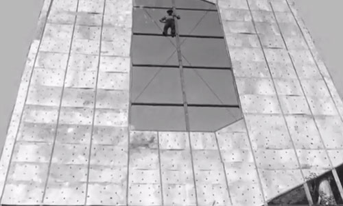
There’s some brief footage of the Hollywood sign looking pretty rough, and as I’d no idea about its history I thought I’d read up.
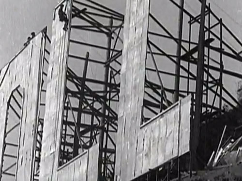
Hollywoodland sign construction
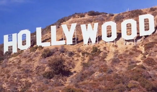
The sign was built in 1923 as “HOLLYWOODLAND” as a promotion to sell real estate. It was flimsily made with wooden panels anchored by telephone poles, so it regularly blew over.
Hollywoodland sign construction
The letters were 45ft tall, and the characters were outlined by 4,000 light bulbs to make it flash in segments — HOLLY, then WOOD, then LAND, before lighting up entirely.
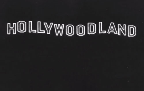
Hollywoodland sign at night
The total cost of the sign was $21,000 (about $265,000 today), and it was only expected to exist for 18 months.
Hollywoodland sign
In 1949, after the sign and land beneath it had been given to the city of Los Angeles, the Hollywood Chamber of Commerce in conjunction with the L.A. Parks Department began efforts to repair the seriously deteriorated sign which had been abandoned by the Hollywoodland real estate group in the 1930s due to the Great Depression. It was decided that the LAND segment be removed, keeping HOLLYWOOD in order to promote the movie industry.
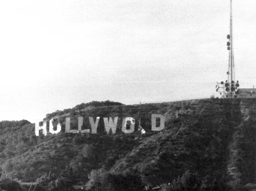
Hollywood sign disrepair
By the 1970s the remaining HOLLYWOOD section was a crumbling wreck (an “O” had fallen down and termites had infested the remaining letters).
Hollywood sign disrepair
Hugh Hefner held a fundraiser at the Playboy mansion in June 1978 where prominent people helped raise money toward the restoration.
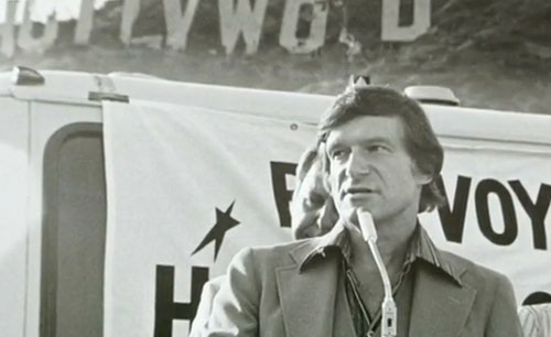
Hollywood sign Hugh Hefner
After Hugh’s party, the Chamber Of Commerce decided to allocate one letter to each of the benefactors.
H: publisher Terrence Donnelly

O: producer Giovanni Mazza

L: Kelley Blue Book founder Les Kelley

L: actor/singer Gene Autry

Y: Hugh Hefner

W: singer Andy Williams

O: Alice Cooper, donating in the name of Groucho Marx

O: Warner Bros. Records

D: Thomas Pooley
The old sign was taken down on August 8th 1978, and the new sign was complete on October 30th that year, built to the same specifications.
Hugh Hefner’s helicopter was used to lift the steel sections into place.
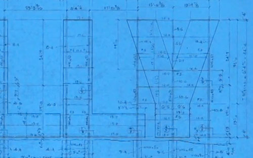
Hollywood sign plans
Hollywood sign rebuilt
Names of the workers who rebuilt the sign in 1978 are preserved under the paint.
Hollywood sign workers 1978
Today the sign is protected and promoted by the nonprofit Hollywood Sign Trust. The most extensive refurbishment in nearly 35 years began in October 2012, and is due for completion in December 2012.
Hollywood sign close up
Hollywood sign
Sources:

A history of the Hollywood sign, on YouTube

Hollywood sign, on Wikipedia

hollywoodsign.org

The famous Hollywood sign, on Today I Found Out

The story of the Hollywood sign, on HOLLYWOODLAND

Hollywood sign to get a facelift, on KTLA


Logo Design Love


Related posts worth a look

A guide to creating a strong identity for your business or personal brand

A guide to creating a strong identity for your business or personal brand:

Brief

Before start creating the elements necessaries for a successful branding, it is important to understand that more than your product or services, you must have a clear idea about the message that you want to communicate and your niche or ideal client, for example lets say you sell cars, what kind of cars do you sell? Used or brand new cars?  What about your clients? Are offering affordable prices or are you looking for a client based on specific preferences or income? It is important to give all the information necessary to the graphic designer to create the right branding that fulfill your corporate or personal branding , for that reason I have created a brand identity questionnaire, this powerful tool has helped me to create great brands concepts for my clients.

Research

This is one of the most important steps, it is obvious that if  you are doing an investment in your logo or complete brand identity, it is because you want to be recognized as the best in your industry and it should be reflected in your sells and profit, once your business experience and niche has been identified, the process will continue with a detailed research into your competitors. The designer should not be shy at this point, personally when a client hire me to create his bran identity, I use as a reference the biggest brands in his industry, for example, months ago a Real Estate Firm hired me to give a new image to the brand identity, TD Real State, my research was not based in small local competitors, my challenge was to create a brand identity to overcome large firms such as  REMAX and Rodeo Realty, no less than that.

Brainstorming

After the graphic designer is fully briefed and armed with relevant information, it is time to unleash the creativity, it doesn’t  matter how crazy the initial ideas could be, in this phase everything counts, personally I create mind maps to keep my ideas organized, it is important to understand we are getting through a creative process and the designer cannot get stuck in details just because the big idea didn’t come out at first try, it is important to start simple, usually small ideas open the door to great concept.

Sketching

Before start working in the computer it is always recommended that the graphic designer place the ideas on paper  for obvious reasons, when we are using the computer our brain is kind of busy manipulating the software, it doesn’t matter if we are experts or not we need to use different tools to draw lines and shapes and this could slow down the creativity, but when we are drawing by hand a pencil is the only thing we need to capture the emerging ideas, even the graphic designer doesn’t need to be a skilled draftsman, the sketching process is just to create some references and then continue digging until create the perfect idea to represent your business or personal branding.

Rendering

Sometimes on the sketching phase the graphic designer creates several options, it os not necessary to render one by one in the computer, that is why is recommend to go over the business brief again and identify which of these ideas are  accomplishing the client’s requirements, personally I prefer to select just one winner version, from there continue the process, creating variations and polishing the concept until I have the perfect logo to be presented to the client.

Presentation and feedback

Basically this is the first time the client has contact with the creates concept, usually I present the logo in black and white, no color selection yet, my purpose  is to get focus just in form and shape, then it should be easiest to analyze the concept and wait for the client feedback to alter or adjust elements of the design to suit some needs or personal preferences. Once the shape and form is approved by the client, I will present some color variations and typographic styles. At this stage the client may wish to choose a combination preference of colors and typographical style. It is important to remember that design is subjective and it is always important to advise the client at every stage with a professional opinion and recommendations before carrying out your requested changes.

Final concept and delivery

After approving the final concept, it is important to provide the client with all the formats necessaries to apply the logo or branding elements were required, the designer must keep in mind that those days the logos  are used in different format and sizes that range from small sizes such as favicon or app, to huge sizes such as billboards and outdoor advertising.

The secret for a successful marketing strategy that works

The secret for a successful marketing strategy that works:

Every business owner wants to attract more clients and increase their revenue. There’s a simple secret to achieve this and I’m going to tell you what it is. Often I get emails like this from entrepreneurs and business owners; “I’m an architect in Los Angeles and as you know this is a competitive market. My portfolio is great and I have worked with prestigious people in this town but for some reason I don’t have the expected results. Javier, how can you help me to get my company’s name out there?
Are you in the same situation? Is your business not growing as fast as you would like? All of us want to be unique and position our products and services to grow our business and market share. These are noble objectives. Now I want to share with you an important principal in marketing, if you apply it, you will double or triple your business in months. This principal is:

Give your clients the information they need to choose you over your competition

You may say  you are already doing this and that you have a list of satisfied clients. But despite a successful track record you’re still not attracting as many new clients as you want. I’m sure you have worked hard to offer a great product or service, but if you’re not getting all the business you can handle, then your marketing isn’t working hard enough and you are not sending out the right message and value proposition.

Business marketing fails because it gives prospects information they aren’t interested in and won’t respond to

When you sign up a new client, your goal is to make them happy by providing them with a superior service or product.  What you are doing when you provide quality services is putting your clients’ interest first and it pays off in repeat sales and referrals. The same principle works in marketing. Put your prospects’ interest first and clearly state your value proposition.If you do this in your marketing, you’ll stand out from the competition, become highly sought after and have more clients than you ever imagined.
This sounds incredibly obvious and simple, but the fact is that hardly any businesses actually do it. When you do, you’ll put yourself light years ahead of your competitors.

How to Apply this Principal

People are always talking about their needs and what they want. These days it is even easier to share information and thoughts. With social media as a tool, you can visit your competitors profiles on Facebook, TwitterYelp and websites to see what people are saying about their products and services. This is a priceless source of information that you can use to stand up over your competition. Whether you’re an architect or sell shoes, give them ideas they can immediately use. Do this again and again and they’ll soon look to you for advice. This is when you should provide proof that you can help them to reach their goals, for example, you can feature past client case studies and testimonials to provide specifics details about the results achieved for other clients.
It’s important to get their attention by leading with a focus on their primary concern or challenge and how you can satisfy that need. Once you know exactly what your prospects and clients are looking for, it would be easier to build a strong  relationship. Keep giving them marketing information that is fresh and relevant, take a look to some creative marketing pieces that I have created, you could find some inspiration that would help you to transmit the right message to your prospects and clients.

12 breeds of clients and how to work with them

12 breeds of clients and how to work with them:
12-breeds-of-clients-and-how-to-work-with-them

Smile

Smile:
I was doing a little research into logos that smile.
Amazon logo

Amazon, designed by Turner Duckworth, 2000
Argos logo

Argos, designed by The Brand Union, 2010
Bledina logo

Bledina
Cider logo

Cider by Kronleins, designed by Amore
Danone logo

Danone
Dusseldorf logo

Dusseldorf, designed by BBDO
i-D logo

i-D Online
Kraft Foods logo

Kraft Foods (previous)
LG logo

LG, 1995
Breast Team logo

Osaka Welfare Pension Hospital Breast Team, designed by Shinnoske Design
Peel logo

Peel District School Board, designed by Hambly & Woolley, 2005
PeoplePC logo

PeoplePC, designed by Landor
Pepsi logo

Pepsi
Smile logo

SMILE Organization
Telenet logo

Telenet
Thomson logo

Thomson Holidays
Traveline logo

Traveline
I can’t think of any others, except for the one smile that rules them all.


Logo Design Love


Related posts worth a look