When pro bono design pays off:
I’ve talked about pro bono design before. It helps inexperienced designers build a portfolio, and is one way for experienced designers to do great work for causes they love.
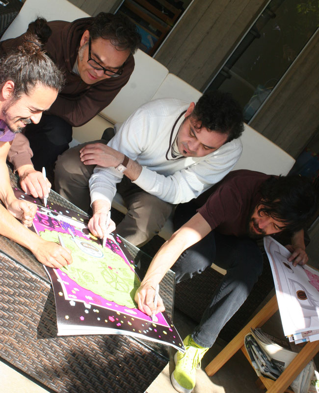
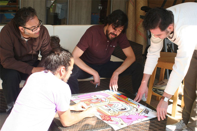
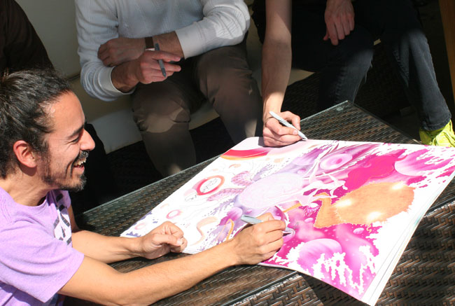
Javier Mateos of Mexico-based studio Xplaye is one designer helping both himself and others with a successful pro bono effort. Two years ago, Xplaye started a series of tribute exhibitions that involved taking a famous music band and translating some of their songs into illustrations.
Last year, the studio created a tribute to Grammy Award winning Café Tacuba, one of the most popular bands in Mexico. The project wasn’t intended to make a profit. The aim was to raise funds to help children with spina bifida.
“Through social media the Café Tacuba musicians heard about what we were doing,” said Javier Mateos. “They were so happy that they decided to autograph all the illustrations to auction them and increase the donations for the association that helped the kids.” The project was covered on CNN Mexico, in Rolling Stone Mexico, on MTV.la, and in all the most important TV and print media in the country.
Approximately $10,000 USD was raised, and five companies approached the spina bifida association to offer materials and supplies.
“This project grew our design bureau in a wonderful way. As a result we are now invited to many conferences, we’re asked to give interviews, and we gained respect from our colleagues in Mexico. It was an amazing and successful experience!”
— JAVIER MATEOS, XPLAYE
This is just one example of how you can grow your business at the same time as helping those in need.
In my next book I’ll share case studies where pro bono design has led directly to paying clients. Pro bono resources:
This week saw the launch of Maria Sharapova’s first entrepreneurial venture, a new gummy and sour candy line dubbed Sugarpova.
Maria enlisted the help of Red Antler (in partnership with Dentsu), and the challenge was to “create a brand, packaging and website for Maria Sharapova’s new premium gummy candy line that represents the sweet, fashionable side of this tennis icon.”
“One of our designers came up with the idea of embedding the pattern within the lips and changing the shape in the middle to express all these different personalities and it dovetailed into this idea of showing the other sides of Maria.”
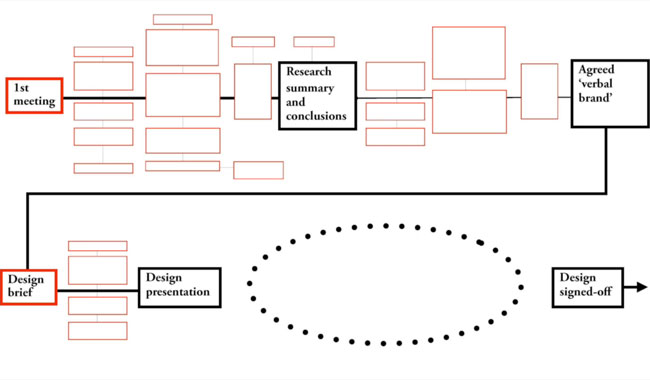
“Meet, talk a lot, summary, talk a lot more, verbal brand, then write up a brief, do quite a lot of work, then present.”
During his (nearly) 20 years in business Michael has very rarely been in the situation where he presented just one idea and it was signed off by the client. This is one of those few designs where it did happen.
“Sitting in the presentation I had the board one way round, turned it over as said, ‘What do you think?’ and they all said, ‘Yeah, it’s great.’”
Here’s a much more common presentation approach.
The best three options are presented (one safe, one adventurous, one scary — from a client perspective), a direction is chosen, developed, then signed off.
One of the best pieces of advice Michael has been given, before he started his own business, was to take the scary option and make it even scarier. That way, the original scary option suddenly seems safer, and more likely to be chosen. It’s those riskier, more polarising options that are often the most successful.
I’ve embedded the presentation below. Or you can watch it on Vimeo.
Worth your time.
Filmed and edited by Nick Culley.
— Update: 29 October 2012
A more in-depth writeup has just been published on johnson banks’ thought for the week.
—