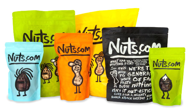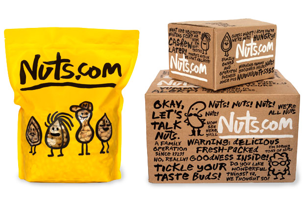
The product used to be called NutsOnline and its packaging identity was totally generic and forgettable. So, when the New Jersey-based online retailer secured the domain name “Nuts.com,” it set out to change its image by hiring a powerhouse team to design a new logo and packaging. The result is an identity that looks like it was created by precocious third-graders – but in a good way. The letters were hand-drawn by Pentagram partner Michael Bierut and digitized by type designer Jeremy Mickel. Illustrator Christoph Niemann made line-drawings of the gang of playful nuts. The effect is fresh and charming, and unconventionally nutty. As breezily executed as this design looks, it takes skill to make it appear spontaneous and carefree and not amateurish and crudely done. A closer looks shows there is a hierarchy to the information on the box and an organization to the design. Even the see-through nut personalities give consumers a glimpse of the product inside. This is sophisticated design made to look naïve.


No comments:
Post a Comment