Wednesday, August 22, 2012

Sugarpova Branding

Sugarpova:
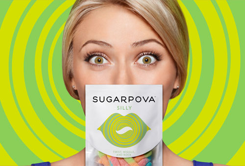
This week saw the launch of Maria Sharapova’s first entrepreneurial venture, a new gummy and sour candy line dubbed Sugarpova.
Sugarpova logo
Maria enlisted the help of Red Antler (in partnership with Dentsu), and the challenge was to “create a brand, packaging and website for Maria Sharapova’s new premium gummy candy line that represents the sweet, fashionable side of this tennis icon.”
Sugarpova logo
“One of our designers came up with the idea of embedding the pattern within the lips and changing the shape in the middle to express all these different personalities and it dovetailed into this idea of showing the other sides of Maria.”

— SIMON ENDRES, RED ANTLER
Sugarpova logo
Sugarpova
Sugarpova
Sugarpova
Sugarpova
Sugarpova logo
Sugarpova website
Sugarpova

A portion of every Sugarpova purchase is given to the Maria Sharapova Foundation for helping children across the world achieve their dreams.


Logo Design Love

Related posts worth a look

Sunday, August 12, 2012

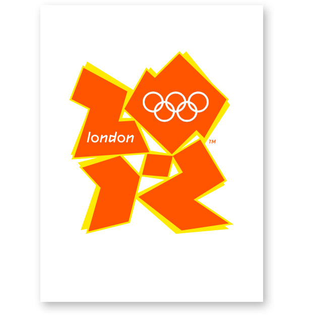
London 2012 Olympics logo copyright infringement claim


This video compares detailing multiple stark similarities between the London 2012 Olympic logo by  Wolff Olins ( released June 2007); and the pre-existing 2006 public artwork INFINITUDE II by artist Michael St.Mark.

In addition, mathematical analyses centred around CAD functions reveal near identical basic design proportions in the works.... all taken together showing beyond reasonable doubt that Wolff Olins copied ( plagiarised ) directly from the artwork Infinitude II in their making of the 2012 Olympic logo.
Additional comparisons with new sports arenas on the Olympic Park strongly suggest the totally novel design and function of the artwork was again copied and incorporated into the constructions.

Wednesday, August 8, 2012

Hiring a Graphic Designer for First Time

Hiring a Graphic Designer for First Time:

If you’ve never worked with a graphic designer before, you might wonder where to start. There is not a standard rule to jude a designer’s work, simply you love it or you hate it. So if you’ve started a new project and you’re not sure about the designer you are looking for, here are some things that could help you to make the right choice:

  • Experience: Ask for a resume, and see what type of companies they’ve worked for, at what capacity (e.g, designer, art director, intern, etc) and for how long. The obvious resume flags are in play!
  • Skiils: Many tend to favor degrees from art and design colleges and four-year universities versus vocational/technical schools. Use your judgment. Remember you want someone who can think creatively, not just someone who can use software. Graphic design is more about communicating ideas than being able to create something gaudy with Photoshop. Also, don’t be discouraged if your candidate doesn’t have a degree at all. It’s all about the work.
  • Rates: Especially if you’re a new business looking to keep costs low. This will vary depending on both the designer and how much you have budgeted. It may also depend on your region. Hourly rates can range anywhere from $30/hr fro graphic design projects to $200/hr for programing and advanced applications. Do they provide a flat fee or an hourly rate? Will they give you a discount in exchange for hiring them for multiple projects? All good questions to ask when talking about rates.
  • Time: If you’re like most clients of graphic designers, you wanted that logo done last week. Obviously, that’s unreasonable, so be sure to start your search early enough to give your designer time to research, organize, and be creative while still making your deadline. The project timeline is a matter between you and your designer, so make sure to discuss when each phase of the project is due when.

So, you’ve got a project, you’ve found me and… What next? Just contact me.

Numerografia

Numerografia:

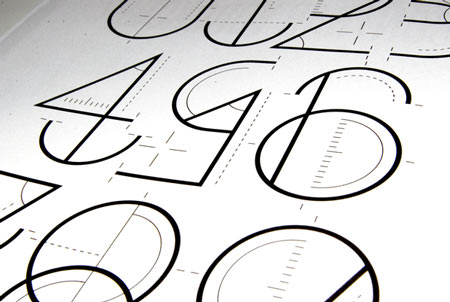
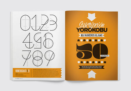
For the April 2012 edition of the Yorokobu magazine, Wete created this cool illustrative font.


Abstract London 2012 Olympiad Posters

Abstract London 2012 Olympiad Posters:

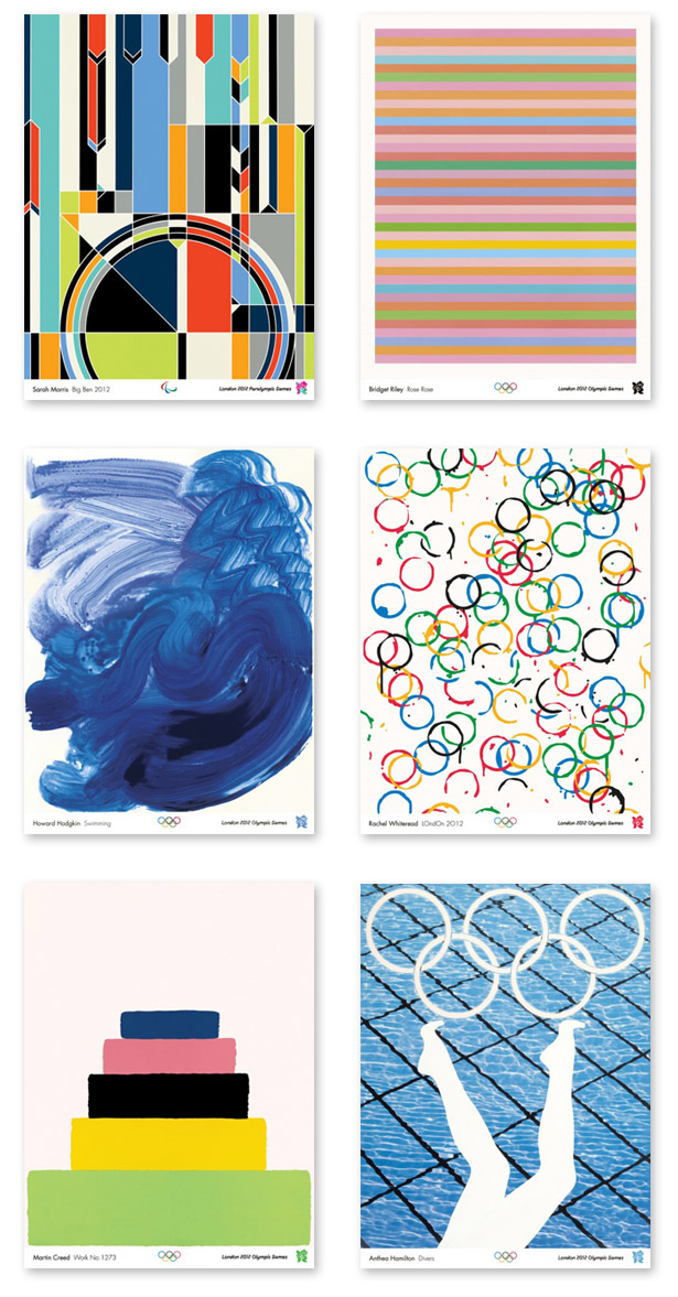
The Tate Britain in London is now showing the official posters of the 2012 Olympic and Paralympic Games, which kick off their opening ceremony tomorrow evening. As the host city, London commissioned 12 leading contemporary artists to impart their own unique visual perspective to the Summer Olympics – interesting, but in some cases, quite obtuse.


Designing a Logo for a Beloved Icon

Designing a Logo for a Beloved Icon:
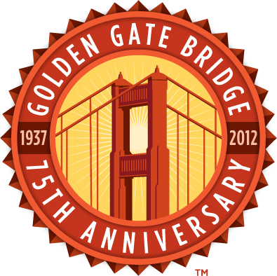
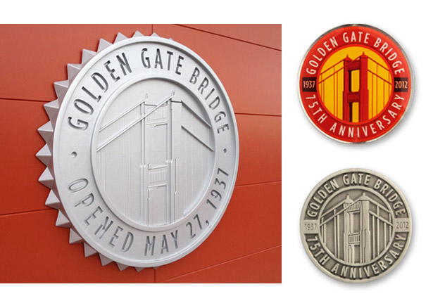
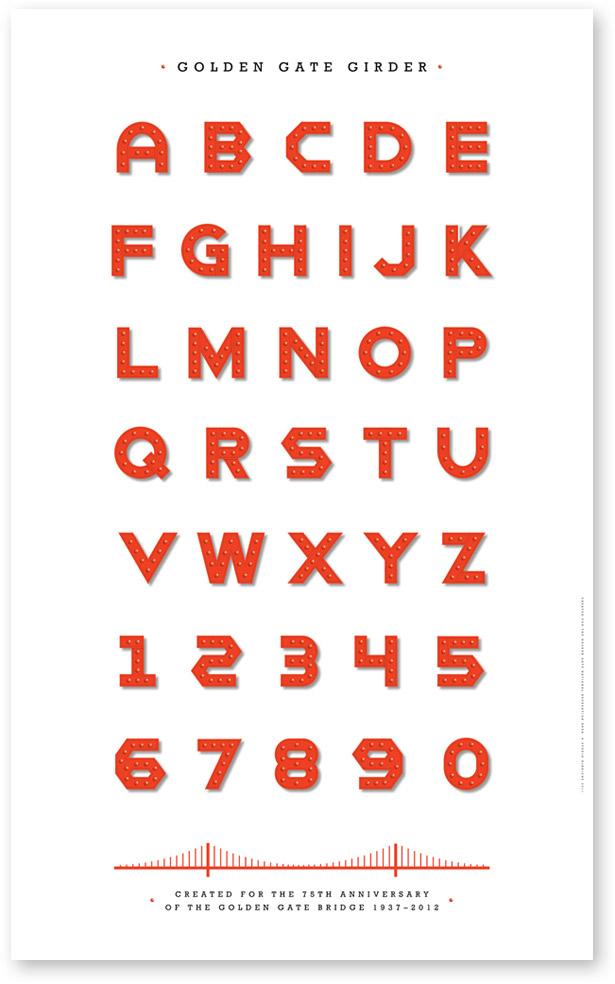
Lately street banners with a logo of the Golden Gate Bridge have been popping up all over San Francisco to mark the 75th birthday of the city’s most beloved icon. Designed by Studio Hinrichs, the anniversary logo features the Bridge’s familiar vermillion red (aka International Orange) color, its soaring 746-foot-high tower and the Art Deco-styled sunburst border of the rivets that bolt the Bridge together. Applied to everything from signage to souvenir merchandise, the 75th anniversary logo was created to work in one-, two- and four- colors and remain crisp whether etched onto glass, cast in metal, or stitched on fabric. Along with the logo medallion, Kit designed a special Bridge typeface, called Golden Gate Girder, for a commemorative poster, single alphabet letter keychains and other uses.


Since the Bridge was conceived nearly a century ago, it has remained a marvel of engineering and style, as iconic to the West Coast as the Statue of Liberty to the East Coast. In 1937, consulting architect Irving Foster Morrow brought an Art Deco sensibility to what was then the world’s longest suspension bridge, giving it a sleek and elegant look with angular lines and gracefully curved cables that refracted the setting sun to dramatic rays of shadow and light. The vermillion red color was chosen to complement the landscape and stand out in the fog. But the results could have been much different had the Navy and Army had their way. In 1937, the U.S. Navy wanted to paint the towers in black and yellow stripes, arguing that “bumble bee stripes” would be more visible to ships in dense fog. The Army Air Corps thought the towers should be painted like a barbershop pole in red and white stripes. Thankfully, they were overruled by Morrow, who felt that the entire span should be all one color, and not clowned up like a bumble bee or barbershop pole. That’s how it has remained.
Year long festivities are planned to mark the 75th anniversary of the Golden Gate Bridge, and celebrations are just getting underway. Concerts, film series, lectures, and fireworks on San Francisco Bay are slated for the month of May. The one event that won’t be repeated from the 50th anniversary celebration is closing the Bridge to auto traffic, so pedestrians can walk across it, as they did at the real opening in 1937. At the 50th anniversary event in 1987, the arch in the roadway flattened under the weight of 300,000 reveling pedestrians, causing a human “traffic” jam to end all traffic jams.
Olympic Branding Champions

Olympic Branding Champions:

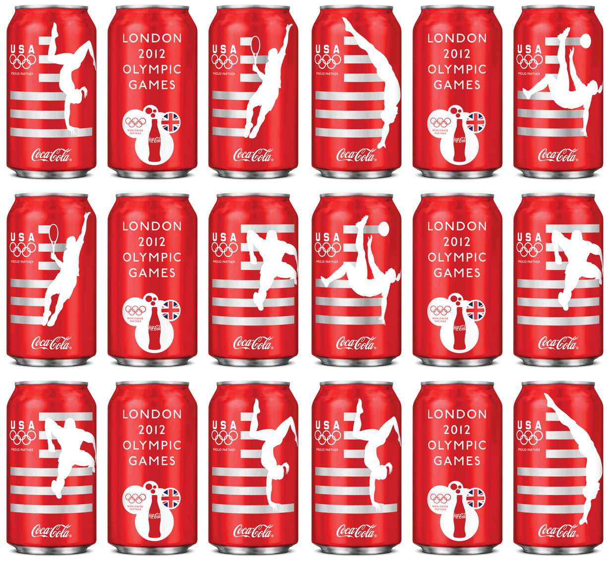
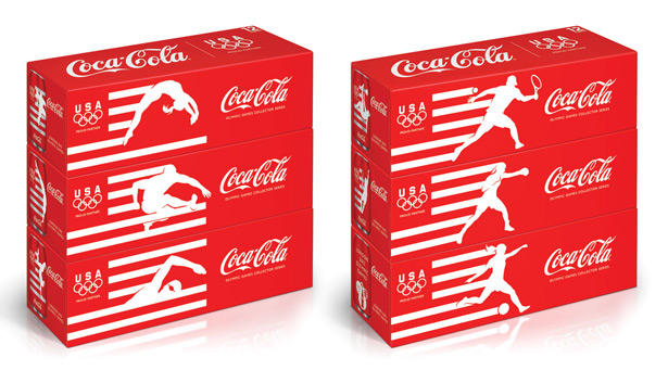
Coca-Cola has just unveiled six limited-edition cans to cheer on Team USA at the London Olympics this summer. San Francisco-based design agency, Turner Duckworth, combined three of the world’s most recognizable icons to communicate the entire story –the stripes of the American flag; the five interlocked rings of the Olympic logo and silhouette of an athlete, and Coca-Cola’s signature red and Spencerian script logotype. The effect is succinct, direct and graphically powerful. Coca-Cola is rotating the can designs throughout the summer, with a new one appearing every two weeks, culminating with a special composite logo timed for the opening of the Olympic Games.


Quiz: Olympic Logos

Quiz: Olympic Logos:
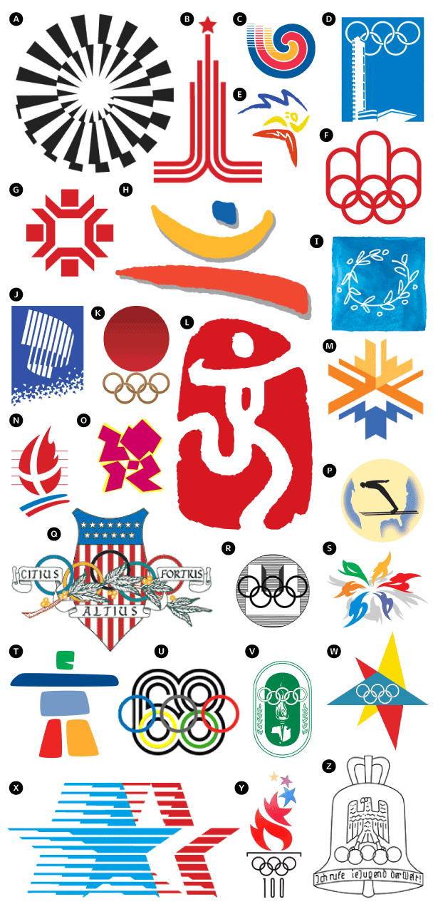
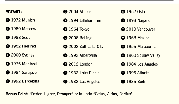
For those of us who have been glued to the television all week watching the London 2012 Olympics, here’s a little quiz to do during commercial breaks. According to modern Olympic tradition, the host country for the Games is responsible for creating an emblem to be used on promotional materials, by sponsors of the Olympics, and on the uniforms of every Olympic competitor. Over the decades, these logos have integrated the cultural symbols and patterns, national colors and artistic styles of the host country into the design. See if you can name the year and location for each of these emblems. A bonus point if you can recite the Olympics motto. Click “Read More” for answers.


Numerografia

Numerografia:

For the April 2012 edition of the Yorokobu magazine, Wete created this cool illustrative font.


The fonts Apple uses

The fonts Apple uses:

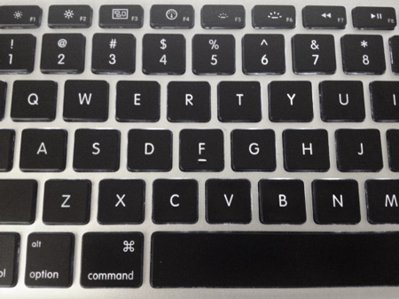
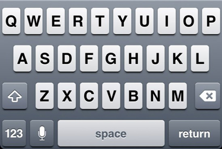
The Apple Gazette has done a little research to find out what fonts Apple uses for its interfaces, products, keyboards,…